Shopify optimisation for a smoother purchase experience
Overview
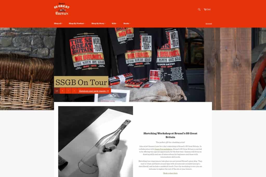
We worked with SS Great Britain to optimise their online gift shop for a smoother purchase experience, with a key focus on design, UX, and accessibility improvements.
Optimising the purchase experience for SS Great Britain’s gift shop involved working with their existing Shopify store. We started with an audit of UX and UI, then followed this with a deeper technical investigation before rolling out improvements.
This work comprised of many small tweaks relating to:
-
Streamlining the mobile experience, navigation and user journeys
-
Site-wide accessibility improvements including hyperlinks, legibility, forms, touch targets and interactions
-
Maintaining brand alignment and continuity
-
Improving interactions with products in sales and in the cart
-
Maintaining user privacy in compliance with GDPR
The story
Streamlining mobile experience, navigation and user journeys
Layouts and usability are especially important on mobile devices, which have more limited space and have different user interaction compared to computers. We enhance the experience of browsing and shopping on mobile by:
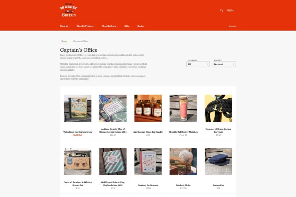
- Updating the pagination for product listings and increasing the size of tap targets to make them easier to hit, improving store usability from mobiles
- Removing a now redundant ‘update cart’ button that appeared next to the checkout on mobile, because Shopify’s cart updates automatically when the quantity changes
We also improved mobile navigation by:
- Adjusting the header on mobile to make it sticky. This keeps the menu just one click away, instead of requiring mobile users to scroll back up to the top of the page
- Adding breadcrumbs to all pages across the site, which anchor the user and where they are within the site. This aids navigation and helps users move through different product pages
Across device types, we also amended a shipping link that previously disrupted the purchase journey by taking users away from their cart, so that it now opens in a new browser tab instead.
Site-wide accessibility improvements including hyperlinks, legibility, forms, touch targets and interactions
We rolled out small but important accessibility tweaks across the site, such as:
- Improving clarity of previously low-contrast links by adding underlines and darkening the text colour, which returns to the original lighter colour on the hover state instead
- Ensuring text is legible at all times
- Updating the colour arrangement on the homepage hero image, similarly with a better text colour contrast and underlines
- Adding form borders, for example on the account login form, to improve the contrast against the background colours; the light border helps differentiate the form and makes it clearer where the form inputs are
- Adding a hover state to the quantity adjustment input
- Adding a transition state for interactions, using underlines and slight changes of colour to make it obvious when there’s some kind of interactivity happening
Maintaining brand alignment and continuity
There were a number of small branding tweaks we made to align the online gift shop with the main SS Great Britain site, for better continuity. These included:
- Adding the typeface that is used on the main website to the store; this is a subtle change to the previous typeface used on the store, but brings brand consistency across both platforms
- Updating colours in the cart, the single page checkout, and buttons, for brand consistency throughout the online gift shop and alignment with the main site
We also made small tweaks to align with user expectations. For instance, we added:
- The SS Great Britain logo to the online gift store and to the single page checkout
- A favicon icon to the Shopify settings, to display the icon on the browser tab when you’re looking at a website
- Social links to the footer
- A link to SS Great Britain’s mailing list
We’ll look under the hood
Get a free audit of your Shopify store from our team of strategists, web designers and web developers.
Improving interactions with products in sales and in the cart
Another area of improvement was around products, for instance how customers can find and differentiate them. We made it easier to see which products are on sale, and understand labels once they’ve added products to their carts, by:
- Adding labels and colours to help visually differentiate when products are sold out or on sale
- Adding more visual differentiation and clarity of sale price reductions
- Adding a cart text label to accompany the cart icon; this is better for UX because icons can be interpreted in different ways by different people, as long as there is space for both
- Tweaking the size of the search inputs, to cater for other menu spacing changes
- Narrowing search and making input text more legible and visible
- Introducing some labels to accompany icons for mobile, such as the menu and cart, to consolidate the meaning of these icons for users with a wide range of digital experience
Maintaining user privacy in compliance with GDPR
And finally, we supported GDPR compliance with a cookie compliance banner that blocks cookies for GA until accepted. These basic acceptance settings ensure user control and consent, as well as legal compliance.
Visit the SS Great Britain gift shop
What’s next for optimising the purchase experience
As we continue our work with SS Great Britain, we intend to further improve navigation, UX, and conversions across their site and store.
Behind the scenes
Watch this video case study to hear about more of our work with SS Great Britain.
Hungry for more case studies?