Proving small changes can make the biggest difference for One25
Overview
One25 is a Bristol charity that supports women who street sex work to move from crisis and trauma towards independence in the community. Their vision is of a world where all women are safe, feel loved and thrive.

What the client wanted
- Engaging homepage redesign
- New header and intuitive navigation with a focus on accessibility and usability
- Showcase impact with stats and stories
- Cohesive experience between social media and website
- Flexible and usable back-end experience
The story
We’ve been working with One25 for more than 9 years. The One25 team wanted a redesign of their homepage that would allow web visitors to get a better overview of the charity straight away, without needing to navigate further through the website.
They felt the homepage could work harder to represent the charity and accurately show the great work they do for women in Bristol.
Challenges
Fresh design, header and navigation
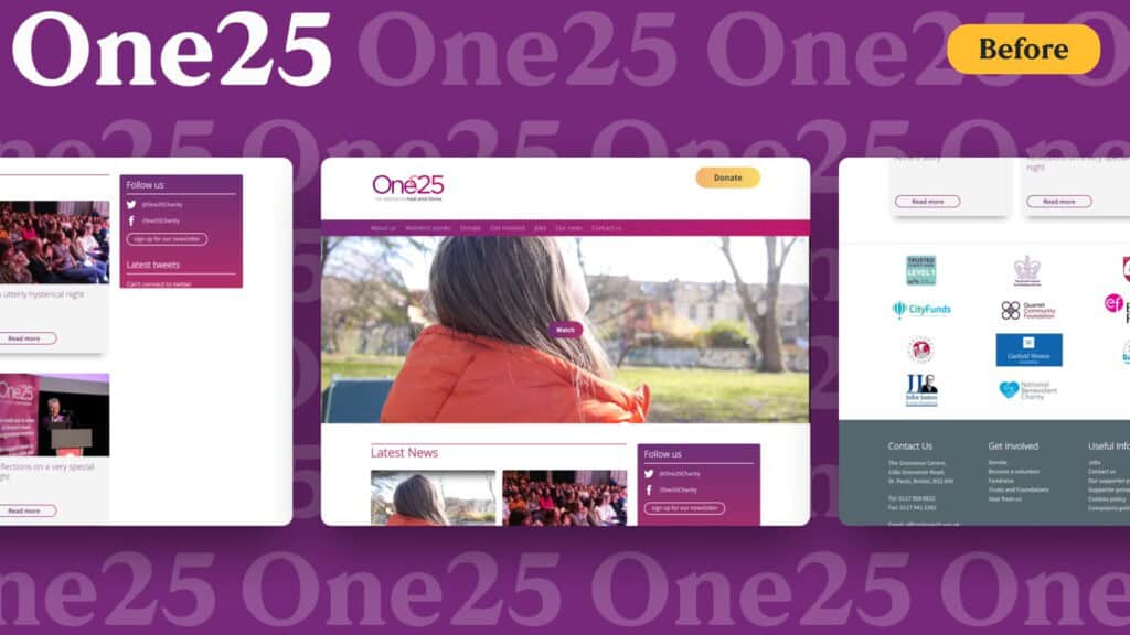
Our overarching challenge was to freshen up the homepage with a modern, approachable design that utilises the charity’s rich colour palette. Over time, the web design had become a little dated and there was plenty of room to better reflect the charity, its mission, impact, and opportunities for web visitors to support or donate.
The main header area pushed useful content far down the page, and it wasn’t clearly showing what One25 stands for or what the charity does.
Navigation was another key area that we needed to tackle. Previously, web visitors browsing the site needed to scroll back up to the top of the page to regain access to the menu. Some pages on the site are very long, so this was causing usability issues.
Demonstrating impact, achievements and social proof
The previous homepage didn’t give the One25 team enough flexibility around what content they could show and how it could be updated. We worked on making the back-end more flexible and usable to empower the charity to easily manage the content on their website.
You don’t need a new website, you need a better one
We love taking an existing website and making it exceptional. And we can transform your website too.
Solutions
New header and navigation
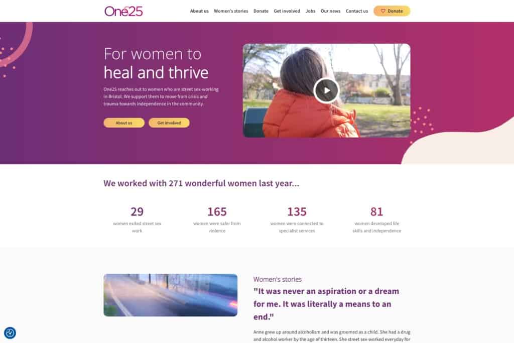
Our designers crafted a new header, implemented by our developers, to reduce the overall header height while bringing more content into the space, such as key links and video content.
We removed the charity’s tagline from under the logo to stop any legibility issues, instead bringing the tagline into the homepage header. And we gave prominence to One25’s mission statement to make the charity’s purpose clear to new site visitors.
Similarly, we redesigned the navigation to be shorter and utilise the space better. We also set the nav bar to be sticky, so it follows users as they scroll up and down pages across the site. This means that navigation is always available and the site is more usable.
The new navigation and header layout not only looks good, but was also designed thoughtfully with a focus on usability and accessibility. The header is clean and condensed on both desktop and mobile, it’s easier to navigate, and One25’s mission takes centre stage. Combined, these changes help web visitors instantly ascertain what the charity does and stands for.
Modern and approachable design
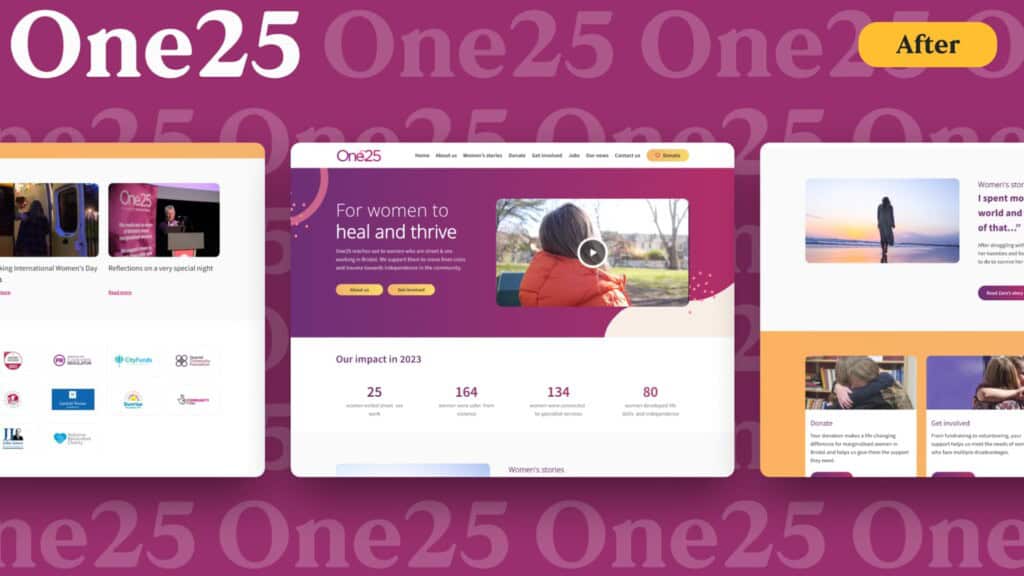
Over time, the previous web design had become a little dated. We rolled out a modern redesign for the homepage, while keeping it approachable and building in the rich colour palette from the One25 brand.

Now the page flow has a considered use of colour and overlapping elements, and is responsive to suit all device types and sizes, with a consistent user experience across all.
Content across the page was re-prioritised and space re-allocated. For instance, by reducing the latest news to a single line, giving partner logos more structure and context, and creating more opportunities for the charity to demonstrate its impact.

We also added a special touch to the donate button in the nav bar with a mouse hover-over effect that fills the heart; an interactive effect for visual interest and user feedback.
Updating the homepage seemed like a daunting task, but Atomic Smash were so helpful, prompt, and professional. It was a totally painless process and we’re really happy with the result.

Cohesive digital presence
One25 has a strong social media presence that wasn’t being reflected accurately on the site.
We updated social links, removed outdated social feeds, and introduced shapes and graphics from their social posts to create a cohesive online presence, with overlapping to create flow and visual interest.
Demonstrating impact and achievements
Stats and stories are valuable content for site users, but as they’re hidden in the depths of the site’s content, they could be easy to miss. One25 can now better demonstrate impact from the homepage with a new stats block and through a spotlight on one of its Women’s Stories.
The animated stats area showcases impact stats collected over the last year. The stats bar engages the site visitor by visually counting up the numbers, and has a clean design using gradient colours without additional clutter.
We added a section that brings one of many stories from women they’ve helped into focus. It highlights one particular story with context and a link, and the site visitor can access all Women’s Stories from here too.
We also added a new links block that teases the type of content that can be found around the site and easily links through to other pages.
Improved editing experience and flexibility
Previously, the One25 team faced some limitations around the content they could show and update. The new iteration of the homepage is now fully editable so their team is empowered to change and update web content whenever they need to.
We added an option to easily toggle media types in the header to suit needs, so they can switch between video or photo. We also ensured the page had flexible content areas, including in the header, stats and other blocks, to give the team greater control.
What we achieved
Modern homepage redesign that positions One25’s mission at the core
New navigation and header layout designed for usability and accessibility
Animated stats and women’s stories that demonstrate impact
Content re-prioritised and space re-allocated
Interactive mouse hover-over effect on donation CTA
Cohesive digital experience that ties together website and social media
Improved editing experience that is more flexible and usable
![]()
The last word
We loved working with Atomic Smash on our homepage redesign and are delighted with the result. They listened to our needs and have created something which we feel really proud of. The process was smooth, efficient and seamless. We’ve had great feedback from users so far and can’t wait for more people to see it.

Get a free audit
We’ll help you make improvements to your website, starting with a free audit.
Hungry for more case studies?